
Painting a Pipeline from App Insights
The Problem
Thousands of items moving into and through inventory. Wide variety of information to track. Myriad things can go wrong. How do we tell whether everything’s working? How can we know when things run more slowly than usual?
I work for a company called EarthClassMail, and we specialize in “Office Mail Automation”. We’ve got a pipeline (composed of people and software) with thousands of pieces of mail (and packages) coming in a day. These items are scanned, added to various databases, considered for further action (content scan, shipping, recycle, etc), and presented to the customer in our UI.
Our existing (legacy) system still tracks most of the above in our SQL database. But we’ve been peeling back the layers, and moving things to clouds (mostly Azure queues and functions, but that list is growing). It’s an ongoing process, and we’re learning as we go. But when things don’t work correctly, we’ve been frustrated with a lack of visibility into where the problems lie. Enter Application Insights.
App Insights
App Insights have been around for a while. I played with it some in the past, but only used their built-in dashboard. The dashboard is powerful in ways (especially for things “native” to Azure, such as App Service requests, throughput, etc), but limited in it’s filtering capabilities (eg, searching for relevant traces). It was hard to find the information I needed. I’d try to get lucky with date ranges, and usually fail.
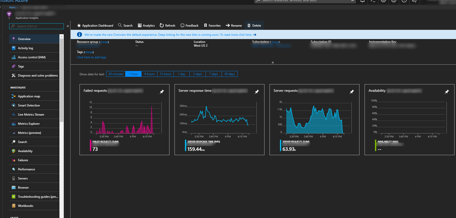 Great Power, Hard to Go Deeper
This led me to disregard the power AppInsights offered, and I kind of moved on. Until I used AppInsights Analytics.
App Insights Analytics
App Insights uses a custom query syntax to allow all the filtering, sorting, and grouping we’ve grown use to with SQL, and applies it to App Insights traces, requests, customEvents, etc. Additionally, AI Analytics provides a powerful visualization framework that will easily (and automatically) render data in readily accessible charts and graphs.
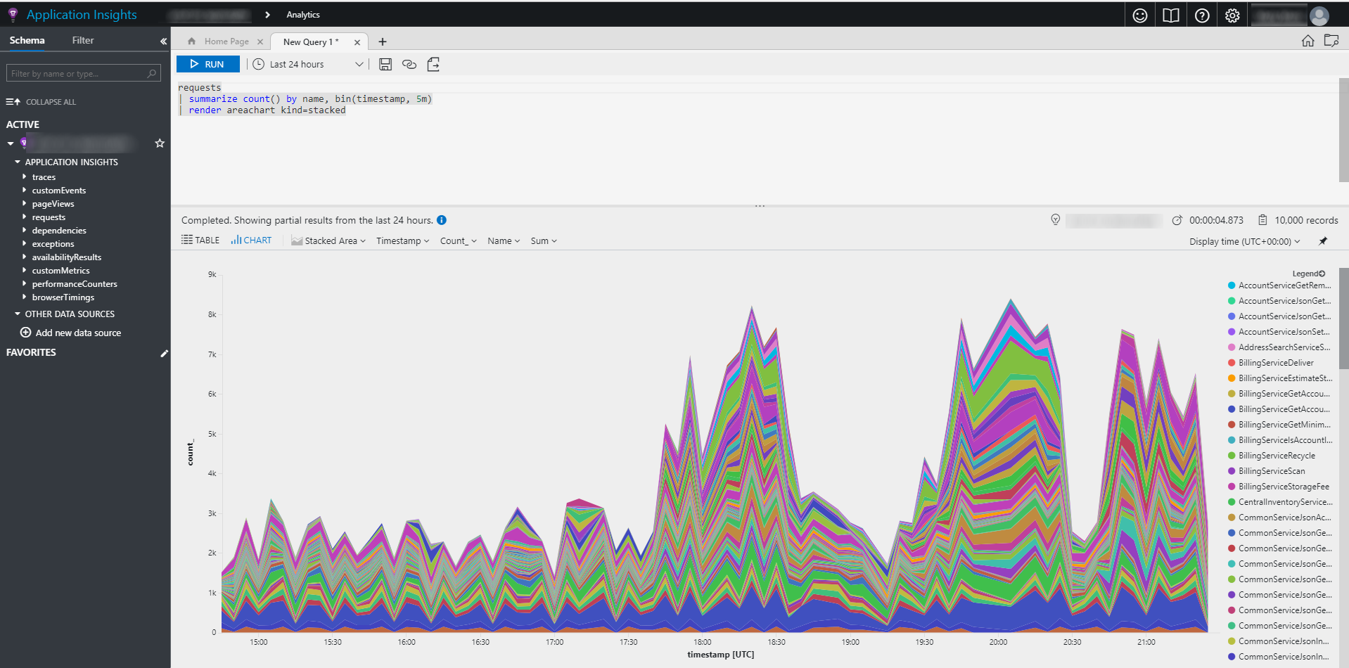 Simple Query with a Powerful Chart
The query language looked confusing to me at first, but the syntax began to make sense once I played with it some. (why can’t they allow just a little SQL? Seems like they could have some sort of interpretor? maybe someone could write one.). The queries can get involved fairly quickly:
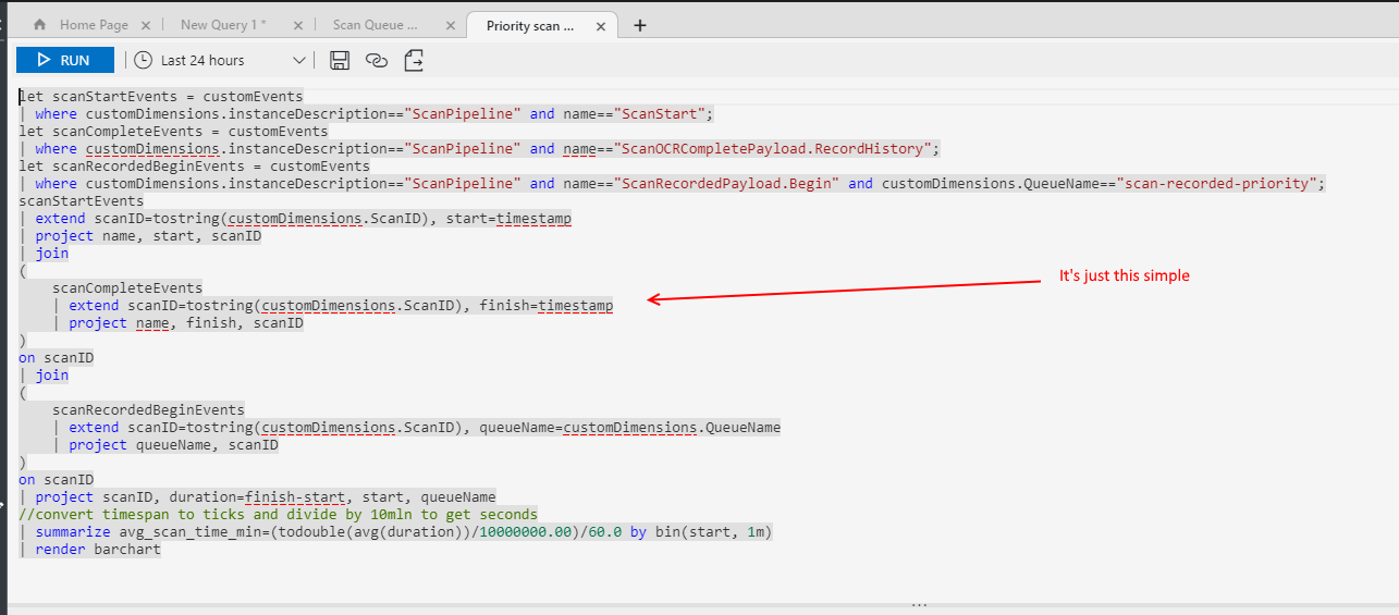 Crazy Query
While the above seems crazy to the untrained eye, you get used to it after a while. It roughly breaks down in the following way:
- “let” - the 3 “let” statements on top are effectively subqueries
- “extend” - similar to “as” in sql (eg, “select id as MyId”)
- “project” - determines the fields to keep from one “stage” of the analytics pipeline to the next.
- the joins above are against the different “sub filters” (let), which allows me to combine different traces from the same scan (in the above, it’s the ScanStart, the ScanRecordedPayload.Begin, and ScanOCRCompletePayload.RecordHistory traces)
The rendering capabilities are extensive:
 All the Charts
Applying App Insights
We’ve only begun to explore using AppInsights in meaningful ways, but are beginning to realize the power it offers in instrumenting “all the things”. The problem we solved that I’m talking about here involved:
- Legacy .Net/SqlServer architecture in a private data center, gradually under migration to cloud.
- Specifically, our “item pipeline” was being lifted out of a SQL state engine, and moved into Azure queues, functions, and an AWS Elastic data repository.
- The pipeline was running slow. Scans were taking way too long to go from “mailman handed us the bag” to “customer can view in the UI”.
We needed a way of knowing our queue sizes, and where individual items stood in the “pipeline”. The next few posts will get into the technical details of how we tackled this problem. They include:
- Queue Size Tracking
- Tracing From .Net
- Quering and Visualizing Pipeline Data